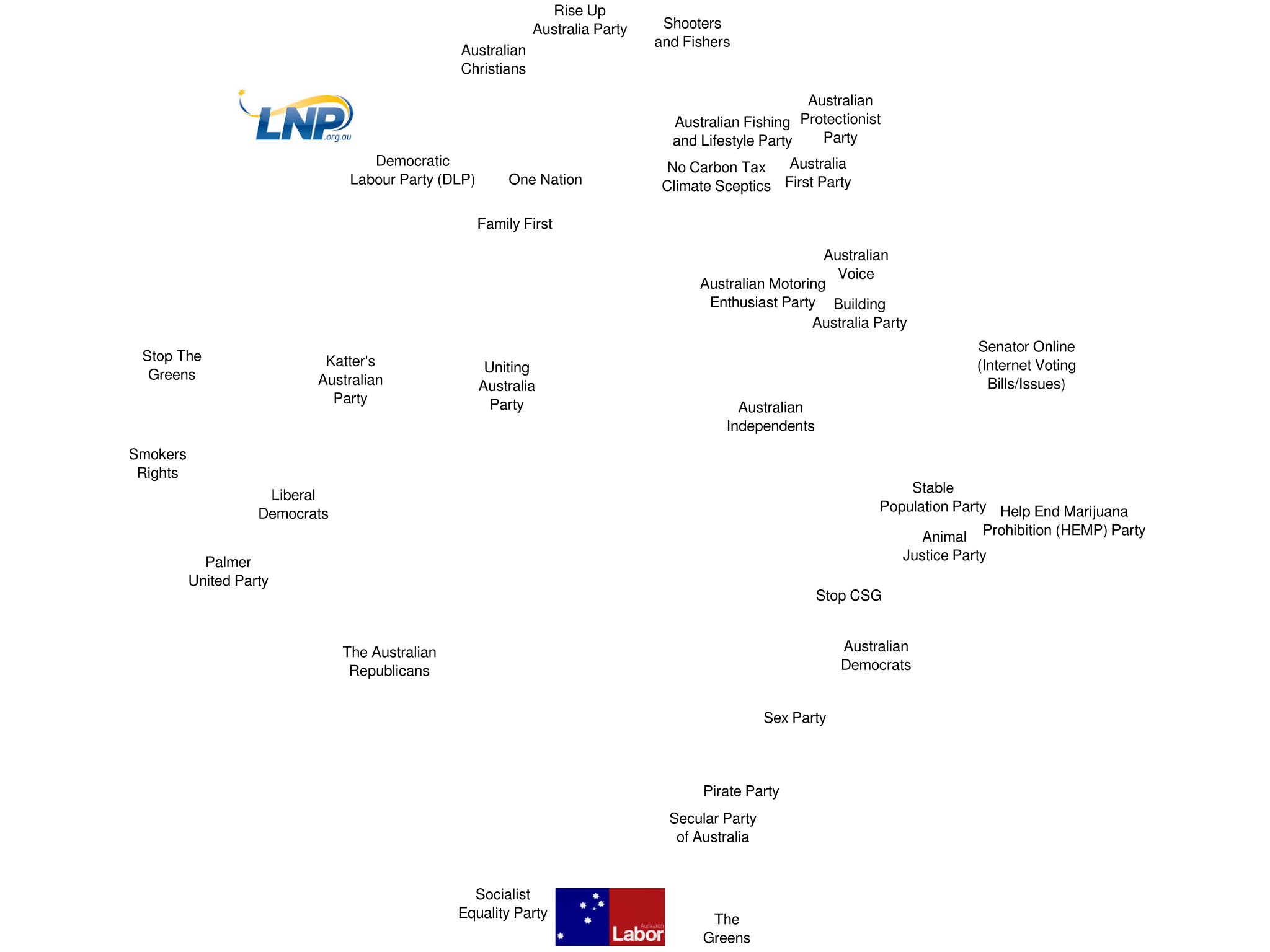
Last weekend the details of candidates for the upcoming Australian Federal election were posted. Here’s a visualisation I’ve made of all the parties with group voting tickets for the Queensland senate. In general, parties closer together in the diagram give one another better preferences on the group voting tickets.
 Where is the data from?
The Australian Electoral Commission makes data available in machine-readable form here.
What metrics did you use?
The ideal distance in arbitrary units between parties A and B is calculated as the number of candidates who would have to be eliminated before a vote above the line for party A would be transferred to party B, added to the number of candidates who would have to be eliminated before a vote above the line for party B would be transferred to party A. In cases where a party lodged multiple group voting tickets with the AEC, the average was taken between the values obtained using each ticket.
What algorithm did you use?
I used simulated annealing to minimise the mean square difference between actual distance and ideal distance for each pair of parties. I then adjusted the visual by hand to avoid having parties whose names overlapped one another.
